

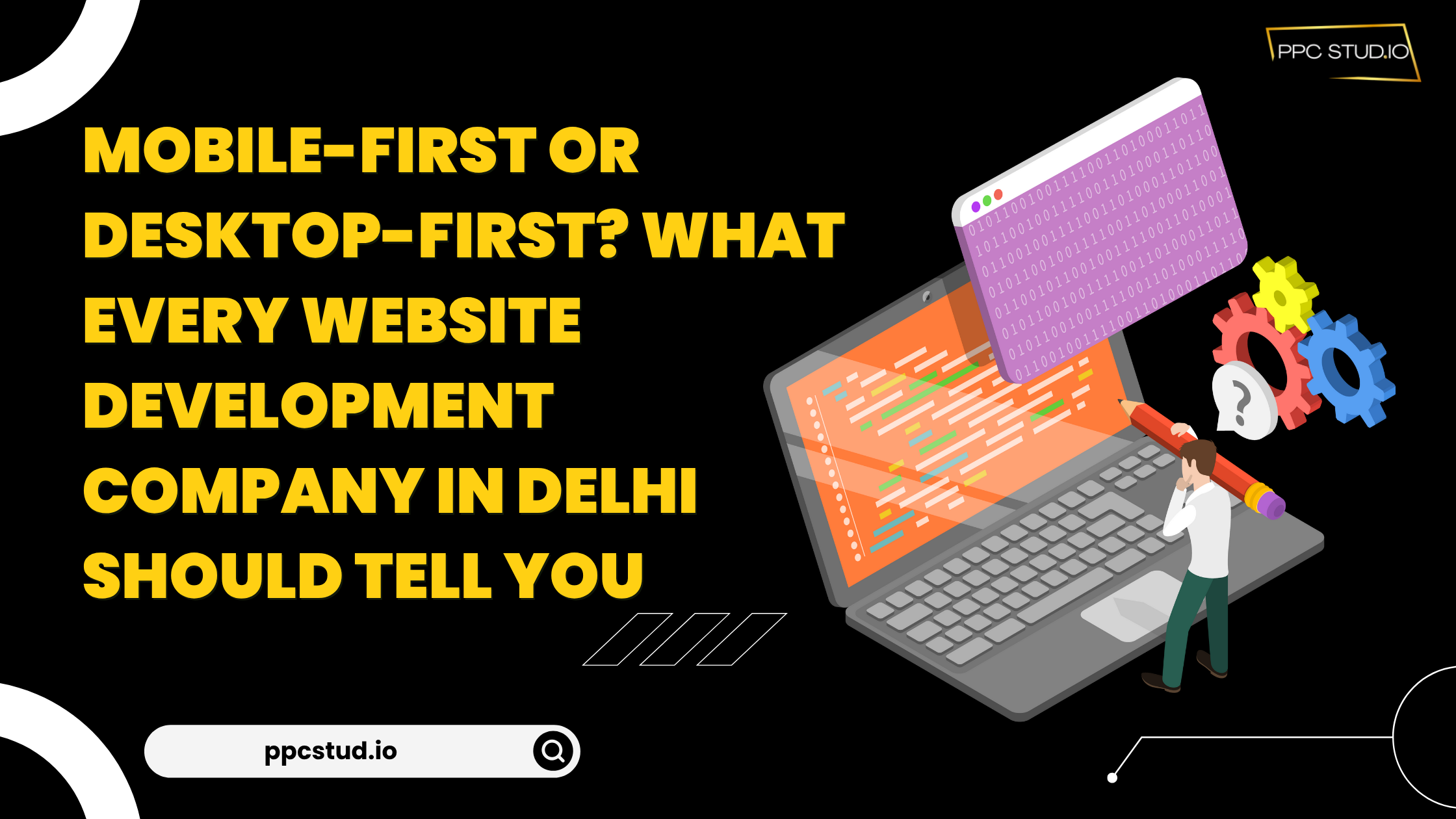
In the digital age, a website is not a luxury anymore; it is a necessity. Designing a website is not only about good looks and appealing content. The way your site is constructed, i.e., a mobile-first or desktop-first approach.
It can have a significant effect on the user experience, search engine ranking and business development. These approaches are important to companies that want to employ a website development company in Delhi.
Understanding Mobile-First vs. Desktop-First Design
Before diving into the benefits of each, it’s important to understand what these terms mean:
- Mobile-First Design: This approach prioritises the mobile version of a website during the design process. Developers focus on ensuring the website works seamlessly on smartphones and tablets first and then scale up the design for desktops.
- Desktop-First Design: In this approach, the website is initially designed for desktop users, and mobile responsiveness is considered later.
Both approaches have their merits, but with mobile internet usage surpassing desktop usage globally, mobile-first design has gained significant attention.
Why is Mobile-First Design Becoming Rising in Popularity?
Rise of Mobile Users
The tablet phone is now the most important internet access device. Research indicates that more than 60 per cent of the web traffic is through mobile devices. A web development firm in Delhi would highly suggest mobile-first design so that your site can work perfectly for most users.
Improved User Experience
Mobile-first sites have been known to be faster and easier to use. Mobile screens are smaller in size, so developers have to be more concerned with simplicity, easy navigation, and critical content. This can most of the time translate to an improved experience for desktop users too.
SEO Advantages
Google has changed to mobile-first indexing, and this implies that the search engine would rank sites mostly using the mobile version of your site. Your mobile site can be slow or poorly designed, and this can cause your SEO to suffer, and this can impact your presence on the internet.
Future-Proof Design
Mobile-first will make sure that your site is up to date with future gadgets and resolutions. With a mobile-first design, your site will fit on any device more easily, whether it is a tablet, a foldable phone, or a wearable.
Advantages of Desktop-First Design
Mobile-first is the trend, but desktop-first design is not going away:
Functionalities and Complexities
When you have a site with intricate functionality, like data dashboards, advanced forms, or interactive applications, you can begin with a full-scale desktop design and then downsize to mobile.
Target Audience Attention
Certain companies serve users who also use desktops, e.g., B2B companies or financial service providers. A desktop-first solution may be more appropriate in such situations.
Design Flexibility
The desktop screens will have more room to be creative in the layouts, graphics, and even animations. Creating these desktop-based designs means that it is easier to tell a story visually and then streamline it to mobile screens.
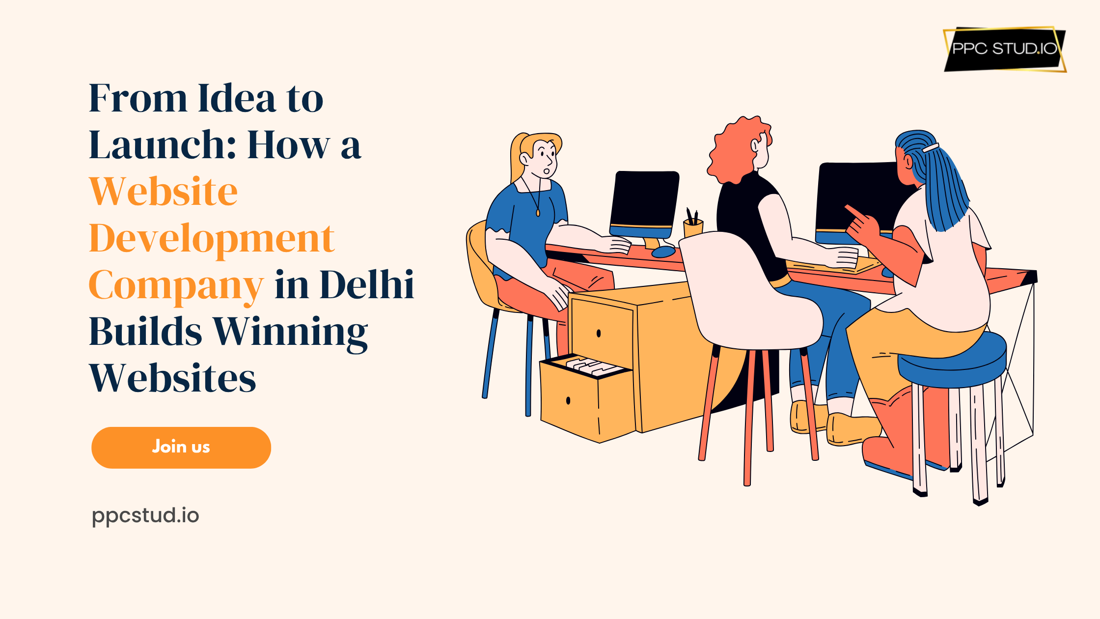
How a Website Development Company in Delhi Guides the Choice?
A reliable website development company in Delhi will evaluate several factors before recommending mobile-first or desktop-first design:
Target Audience
Determine who will be using your site most. Mobile-first will be used by the younger generation of users, who are on-the-go smartphone browsers, and desktop-first will be used by the committed professionals or office users who use big screens and complex features.
Website Purpose
Take into account your primary objective for your site. Mobile-first design is best when it is required to have a fast browsing experience, quick purchase and interactions. Desktop-first can be considered a better fit for sites that demand a deeper analysis, lots of content, complicated tools, etc.
Budget and Timeline
Evaluate your resources for the project. Mobile-first designs can be time- and cost-saving in the long term, as it is less difficult to scale to desktops, but it can be more costly, complicated, and time-consuming to port a desktop-first site to mobile.
SEO Strategy
Put search engine priorities into consideration. A mobile-optimised site is better in Google mobile-first indexing, as it raises your ranking, exposes you to more people and devices, and can improve the user experience. It also results in improved SEO performance and more organic traffic to your site.
Choosing the Right Partner in Delhi
Your website’s success depends heavily on choosing the right website development company in Delhi. Look for a partner who:
- Understands the latest trends in mobile-first and desktop-first design.
- Has a strong portfolio showcasing responsive and user-friendly websites.
- Offers SEO-friendly coding and website performance optimisation.
- Provides continuous support and maintenance.
By working with experts, you ensure that your website is not just visually appealing but also functional, fast, and optimised for both users and search engines.
Conclusion
Mobile-first and desktop-first design is not a one-size-fits-all decision. But with the introduction of the mobile use of the internet and the introduction of mobile-first indexing by Google, mobile-first design is now becoming the choice of most companies. The ultimate choice should be determined by your target audience, features of a webpage, and business goals.
Need help developing a responsive, mobile-first, and SEO-friendly website in Delhi, with a trusted company to help you with it? PPC Studio has the knowledge to make your vision work.
Find a partner who can explain the ins and outs of the modern web and help your business shine through the Internet.


 Google Ads Management
 Meta Ads
 SEO
SEO High Quality Lead Generation
 Boost Ecommerce Sales